
In a world where digital interactions are increasingly diverse, a responsive website design has become a cornerstone of effective digital strategy. Responsive design ensures that your website looks and performs optimally across all devices—whether it’s a smartphone, tablet, laptop, or desktop. This adaptability not only enhances user experience but also future-proofs your digital presence. In this article, we’ll explore why responsive design is essential, its benefits, and how it can help you stay ahead in an ever-evolving digital landscape.
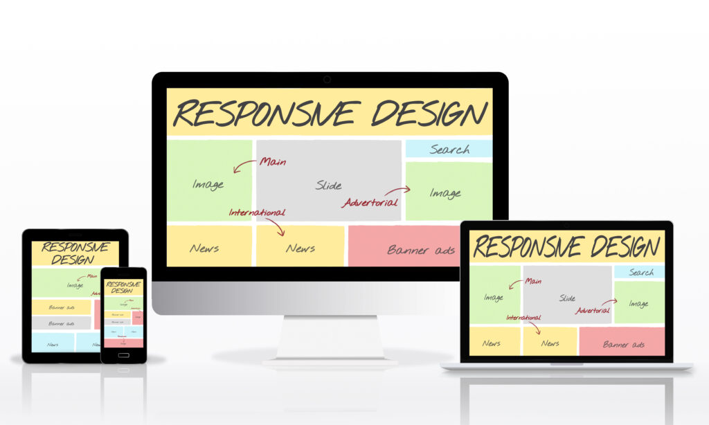
What is Responsive Website Design?
Responsive website design refers to the approach of building web pages that adapt seamlessly to different screen sizes and orientations. Unlike traditional web design, which often requires separate versions for desktop and mobile devices, responsive design uses flexible grids, layouts, and media queries to ensure that your site adjusts automatically to fit the screen on which it is viewed.
The Importance of Responsive Design
Enhanced User Experience
Seamless Access Across Devices: Users expect a consistent and intuitive experience, regardless of whether they’re on a smartphone, tablet, or desktop. Responsive design ensures that your website delivers a user-friendly experience across all devices, making it easier for visitors to navigate, read content, and interact with your site.
Faster Load Times: Mobile users are especially sensitive to load times. A responsive design that is optimized for mobile performance ensures faster load times, which can significantly improve user satisfaction and reduce bounce rates.
Improved SEO Performance
Google’s Mobile-First Indexing: Google uses mobile-first indexing, meaning it primarily uses the mobile version of a site for ranking and indexing. A responsive design ensures that your site performs well on mobile devices, which is crucial for maintaining or improving your search engine rankings.
Unified URL Structure: With responsive design, you maintain a single URL for both desktop and mobile versions of your site. This simplifies SEO management, as all link equity and social shares are consolidated, rather than being split between separate desktop and mobile URLs.
Cost-Effectiveness
Single Codebase: Maintaining one responsive site is more cost-effective than managing separate sites for different devices. This reduces development and maintenance costs, as updates and changes need to be implemented only once.
Future-Proofing: A responsive design can adapt to new devices and screen sizes as they emerge. This eliminates the need for frequent redesigns and ensures your site remains functional and attractive over time.
Increased Conversion Rates
Improved Accessibility: A responsive website ensures that users can easily complete actions such as making a purchase, filling out a form, or contacting your business, regardless of the device they are using. This accessibility can lead to higher conversion rates.
Consistent Branding: A responsive design provides a consistent brand experience across all devices. This strengthens brand identity and trust, which can positively impact user engagement and conversions.
Key Components of Responsive Design
Flexible Grid Layouts
Fluid Grid Systems: Use fluid grids that scale proportionally to the size of the user’s screen. This ensures that your website’s layout adapts fluidly to different screen sizes, providing a consistent user experience.
Viewport Units: Employ viewport width (vw) and viewport height (vh) units to size elements relative to the user’s screen size. This ensures that text, images, and other elements adjust appropriately.
Flexible Images and Media
Responsive Images: Utilize responsive images that scale and adapt to different screen sizes. Techniques like the srcset attribute and CSS media queries can help serve appropriately-sized images based on device characteristics.
Fluid Media Embeds: Ensure that embedded media such as videos and iframes are responsive and adjust to different screen sizes. This prevents issues with overflowing or cut-off content.
Media Queries
CSS Media Queries: Implement CSS media queries to apply different styles based on device characteristics such as screen width, height, and orientation. Media queries allow you to tailor the design and layout to fit specific screen sizes and resolutions.
Breakpoints: Define breakpoints where the layout or design should change to accommodate different devices. Common breakpoints include those for mobile phones, tablets, and desktops.
Mobile-First Approach
Prioritize Mobile Design: Start designing and developing with mobile devices in mind first. A mobile-first approach ensures that the core functionality and content are optimized for smaller screens before scaling up to larger devices.
Progressive Enhancement: Build your site with basic features for mobile users and enhance the experience for users on larger screens with additional functionality and design elements.
Best Practices for Implementing Responsive Design
Test Across Devices
Cross-Device Testing: Regularly test your website on various devices and screen sizes to ensure that it performs well and provides a consistent experience. Use emulators, simulators, and real devices to conduct comprehensive testing.
User Testing: Gather feedback from real users to identify any issues or areas for improvement in the responsive design. This helps you make data-driven decisions to enhance the user experience.
Optimize Performance
Speed Optimization: Optimize images, minify CSS and JavaScript, and leverage browser caching to improve load times. Performance optimization is crucial for maintaining a positive user experience, especially on mobile devices.
Responsive Typography: Use responsive typography techniques to ensure that text is legible and appropriately sized across different devices. Consider using relative units like em or rem for font sizes.
Stay Updated with Trends
Adopt Emerging Technologies: Stay informed about new technologies and trends in web design. Incorporating modern techniques and tools can help keep your responsive design up-to-date and aligned with industry standards.
Continuous Improvement: Regularly review and update your website’s responsive design to address new device types, screen sizes, and user preferences. Continuous improvement helps maintain a high-quality user experience.
Conclusion
Responsive website design is an essential component of a future-proof digital strategy. By ensuring that your site adapts seamlessly to various devices and screen sizes, you enhance user experience, improve SEO performance, and optimize costs. Embracing responsive design not only helps you stay competitive but also positions your brand for long-term success in the ever-evolving digital landscape. Invest in responsive design to create a dynamic and accessible web presence that meets the needs of today’s diverse and mobile-centric audience.