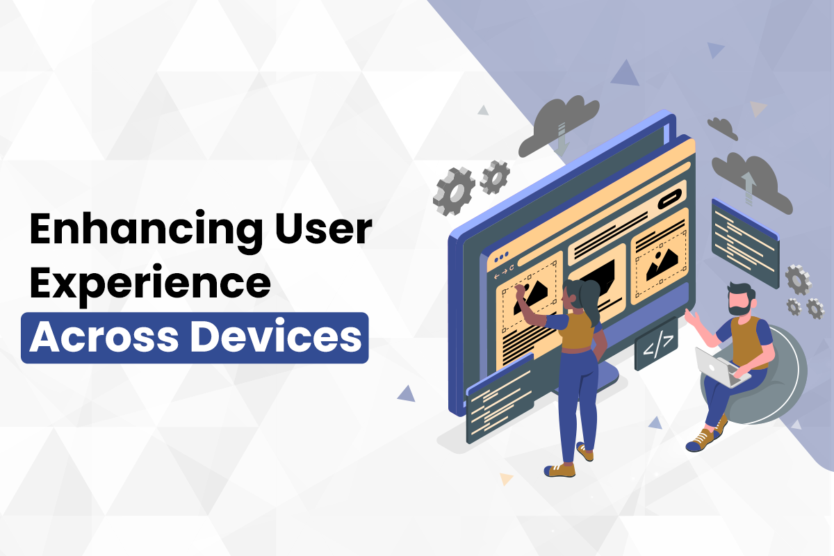
In today’s digital landscape, a website isn’t just a web address – it’s a vital storefront, a hub of information, and a crucial touchpoint for connecting with your audience. But with the ever-expanding variety of devices users access the internet from, ensuring a seamless experience across all screens is paramount. That’s where Responsive Web Design (RWD) comes in.
What is Responsive Web Design?
RWD is a design approach that ensures your website automatically adjusts its layout and functionality based on the screen size of the device it’s being viewed on. Whether someone is browsing on a desktop computer, a tablet, or a smartphone, your website should adapt seamlessly to deliver an optimal user experience (UX).

Why is Responsive Web Design Important?
There are numerous reasons why RWD should be a cornerstone of your web development strategy. Here are just a few:
- Enhanced User Experience: RWD ensures users don’t have to pinch, zoom, or scroll excessively to navigate your website. This leads to a more enjoyable and frustration-free experience, which can significantly impact user engagement and conversion rates.
- Improved Search Engine Optimization (SEO): Google prioritizes mobile-friendly websites in search results. By implementing RWD, you’re telling search engines your website is optimized for all devices, potentially boosting your website’s ranking.
- Reduced Maintenance: Maintaining separate websites for different devices can be a significant burden. RWD eliminates the need for multiple versions, saving you time and resources.
- Increased Brand Consistency: RWD ensures your brand message and visual identity remain consistent across all devices, fostering stronger brand recognition.
- Future-Proofing: With the constant influx of new devices and screen sizes, RWD ensures your website remains adaptable and user-friendly for years to come.
Creative Solutions : Building Responsive Websites for your Success
At Creative Solutions, we understand the importance of RWD in today’s digital world. Our team of experienced web designers and developers are passionate about crafting beautiful, responsive websites that not only look stunning but also deliver an exceptional user experience across all devices.
Here’s what we offer:
- Agile Development: We collaborate closely with you to understand your unique needs and goals, ensuring the RWD solution we develop aligns perfectly with your vision.
- Mobile-First Approach: We prioritize mobile optimization, guaranteeing your website looks and functions flawlessly on even the smallest screens.
- Cross-Browser Compatibility: We ensure your website displays correctly across all popular internet browsers, maximizing your reach.
- Performance Optimization: We optimize website loading speeds for all devices, keeping users engaged and on your website.
Responsive Web Design: A Smart Investment
Investing in RWD is an investment in the future of your online presence. It fosters a better user experience, enhances brand credibility, and ultimately, drives business growth.
Ready to take your website to the next level?
Contact Creative Solutions today for a free consultation and discover how Responsive Web Design can elevate your user experience and unlock your website’s true potential!